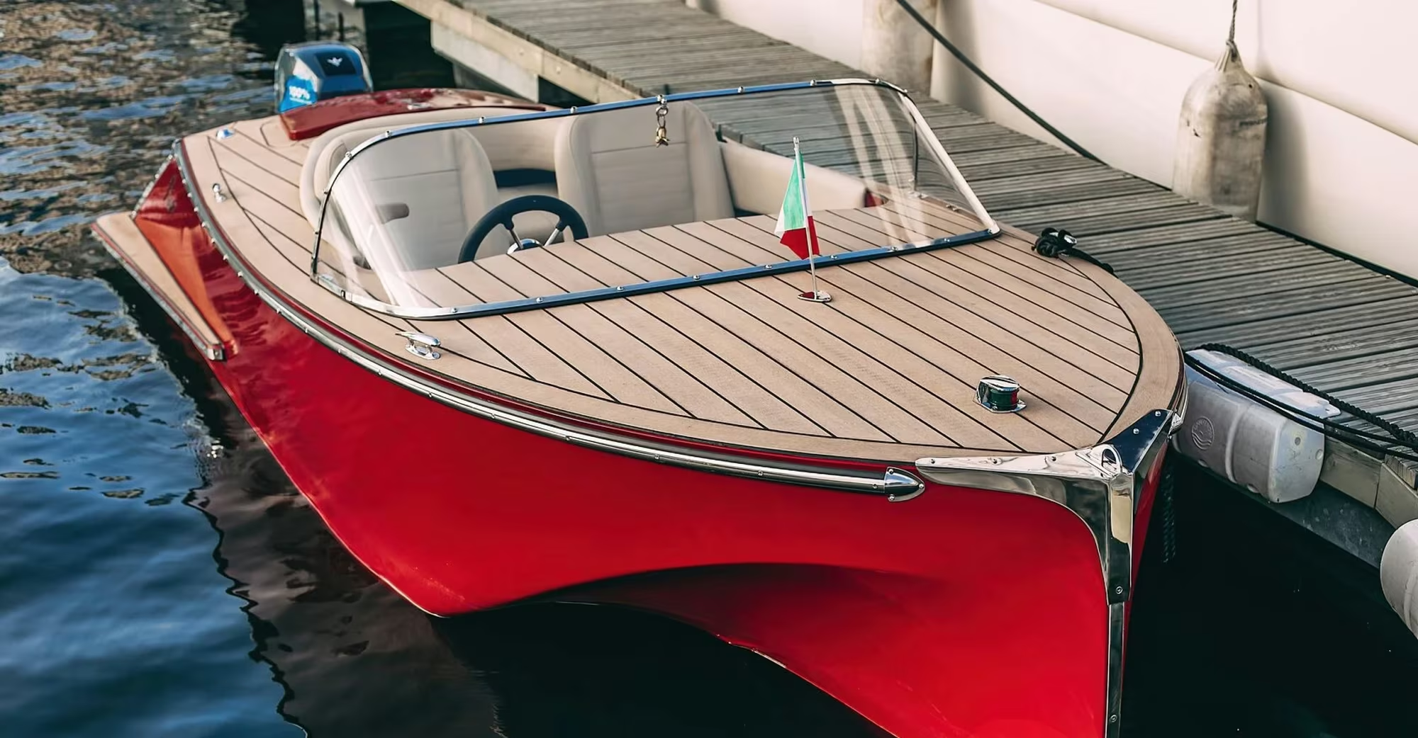
Dock 622 offers premium self-drive motorboat hire for exploring rivers
and lakes
The project focused on developing the company’s visual identity,
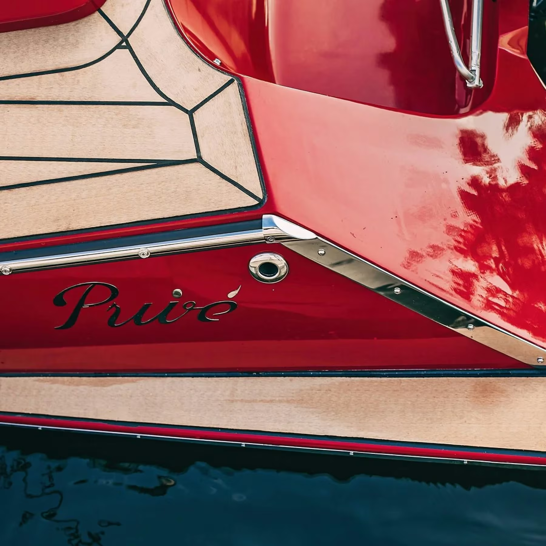
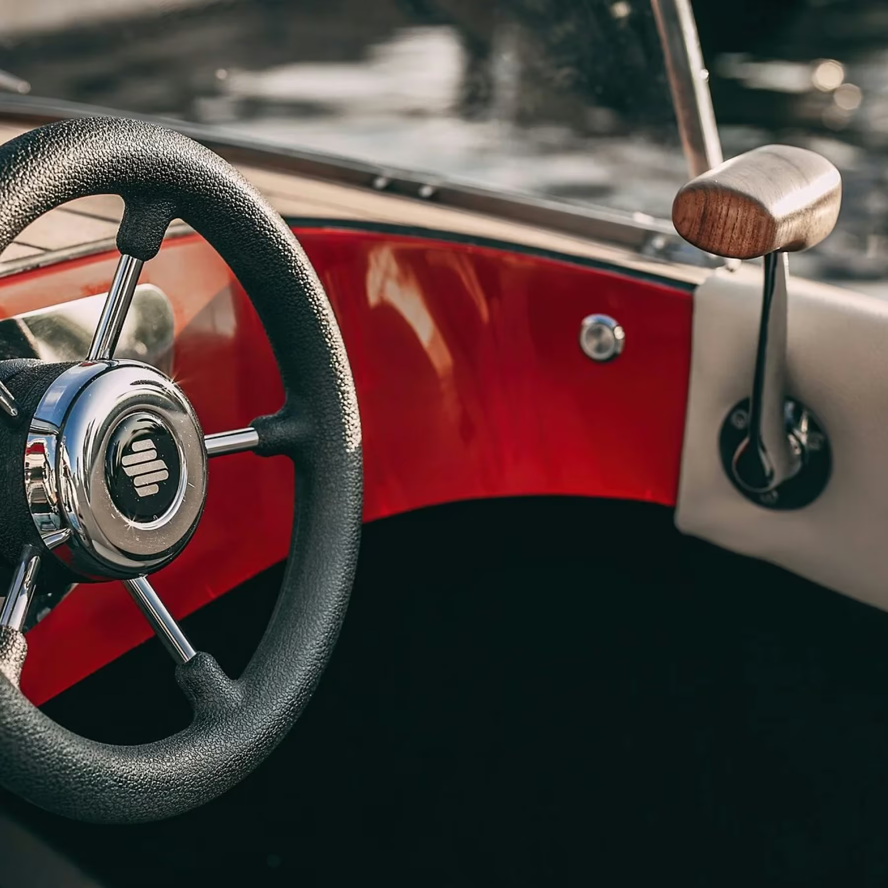
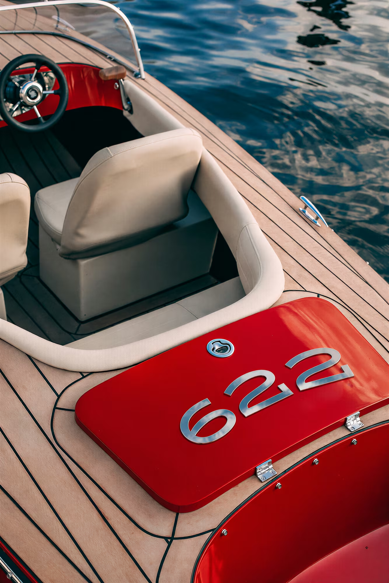
with the boats themselves as the starting point. Their silhouettes,
finishes, and colours evoke Italian cars of the 1960s and 1970s.
I carried this aesthetic into the brand, conveying a sense
of understated luxury and attention to detail
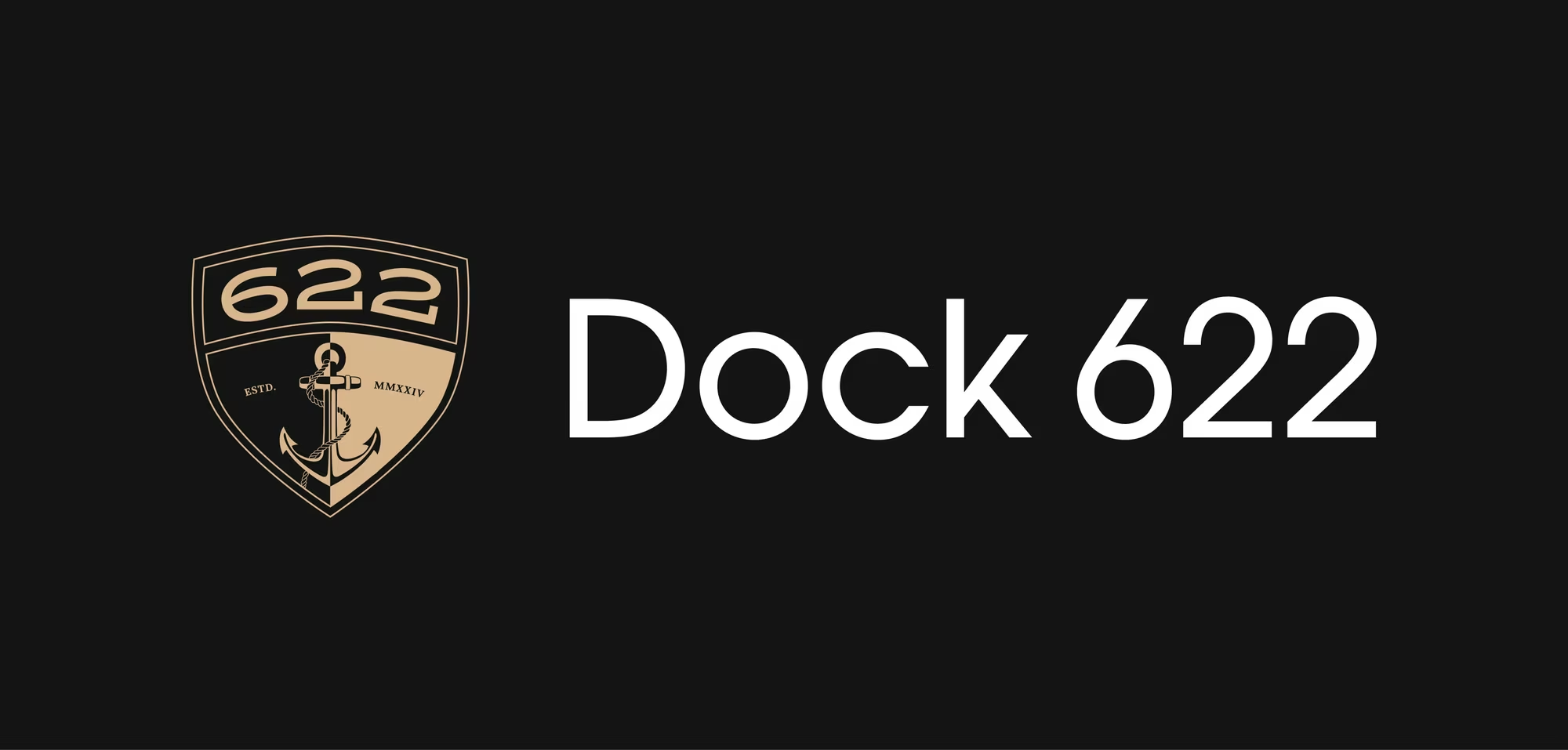
The logo’s shape evokes both the bow of a motorboat
and a family crest. Drawing on the aesthetic of family insignia
and club emblems, it suggests a sense of heritage that reflects
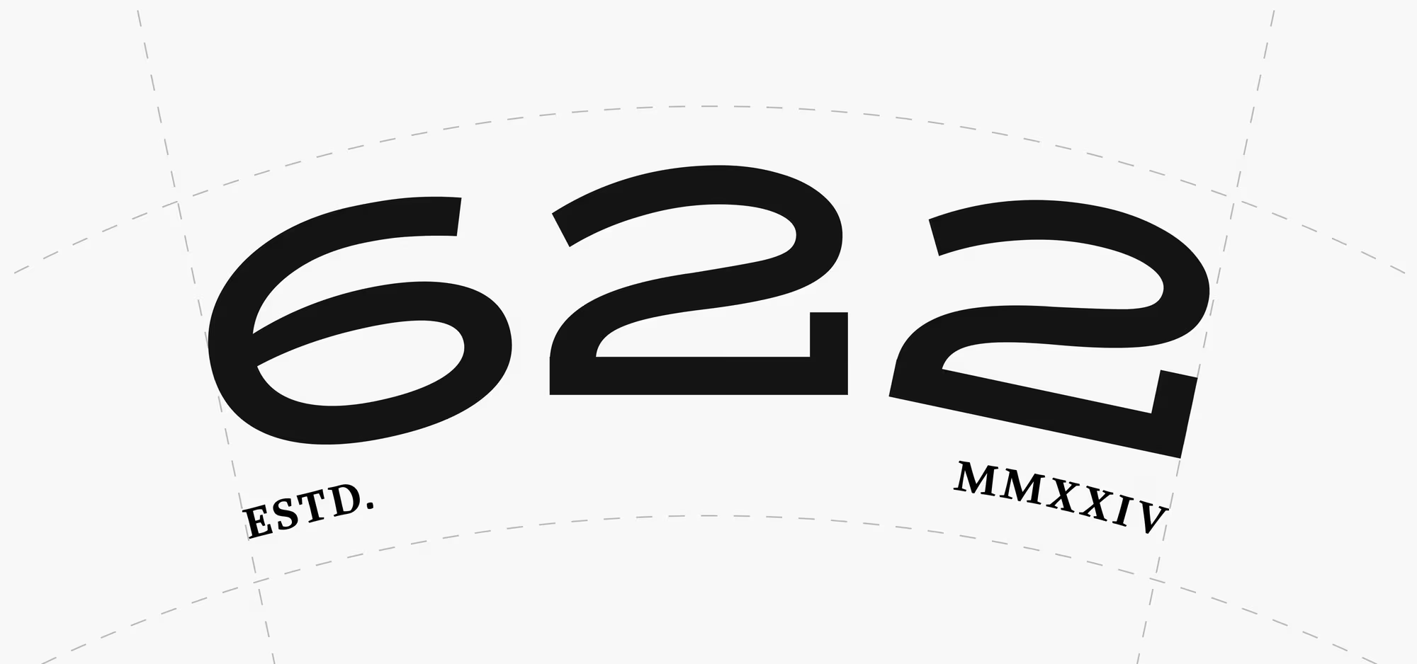
the brand’s character. The clean design of the numerals 622 gives
the emblem a contemporary feel and allows them to function
as a standalone mark
Graphite and a muted bronze set a calm, refined tone
for the identity. Together, they convey understated luxury
without ostentation. The versatile palette works equally well
in minimal compositions and bold, large-scale graphics
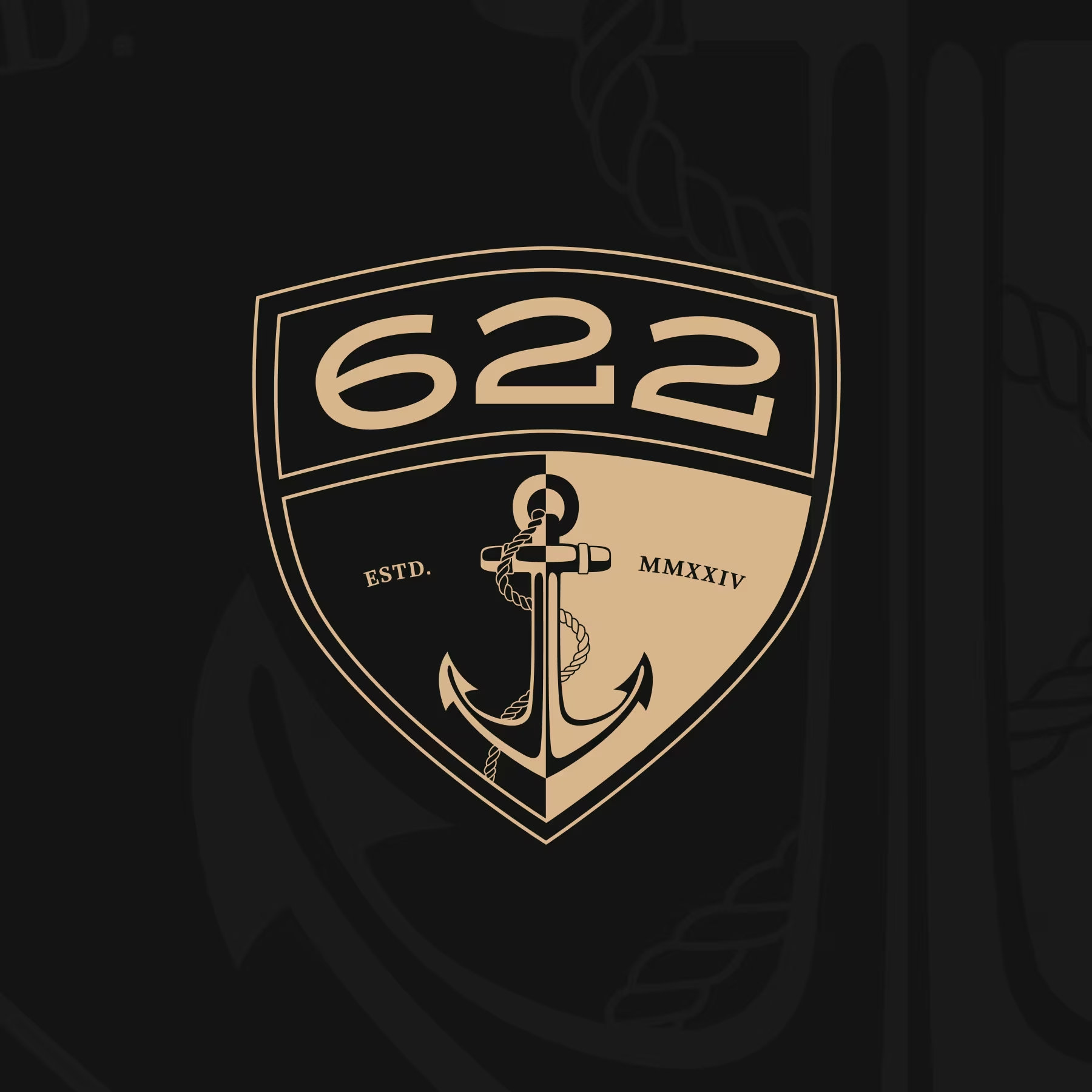
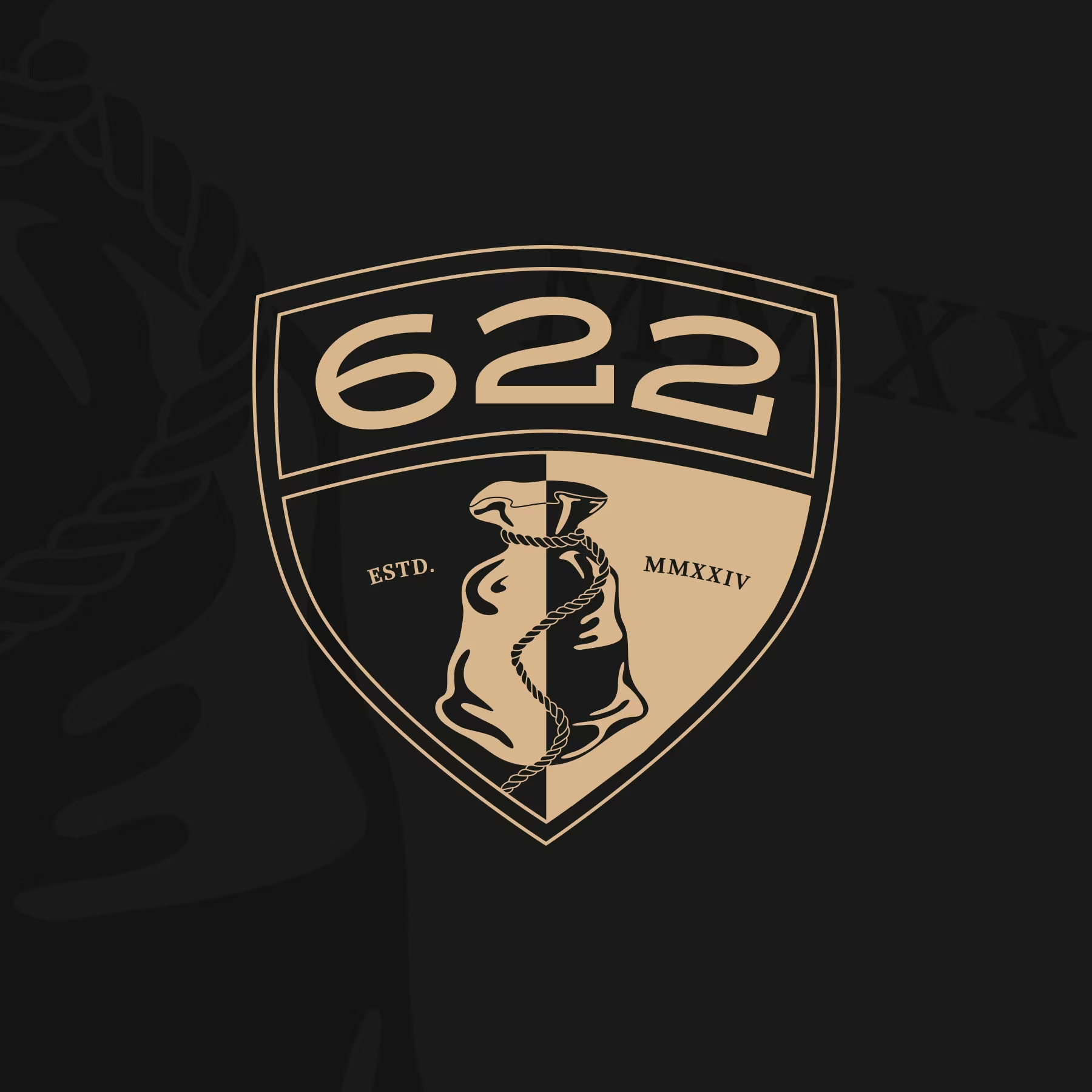
The emblem is designed to unite the different business divisions.
The upper section, featuring the numerals 622, remains consistent, while
the symbol below identifies each division: an anchor for Dock
and a sack for Warehouse. This allows new divisions to develop
their own marks within a shared visual system, retaining a family
resemblance
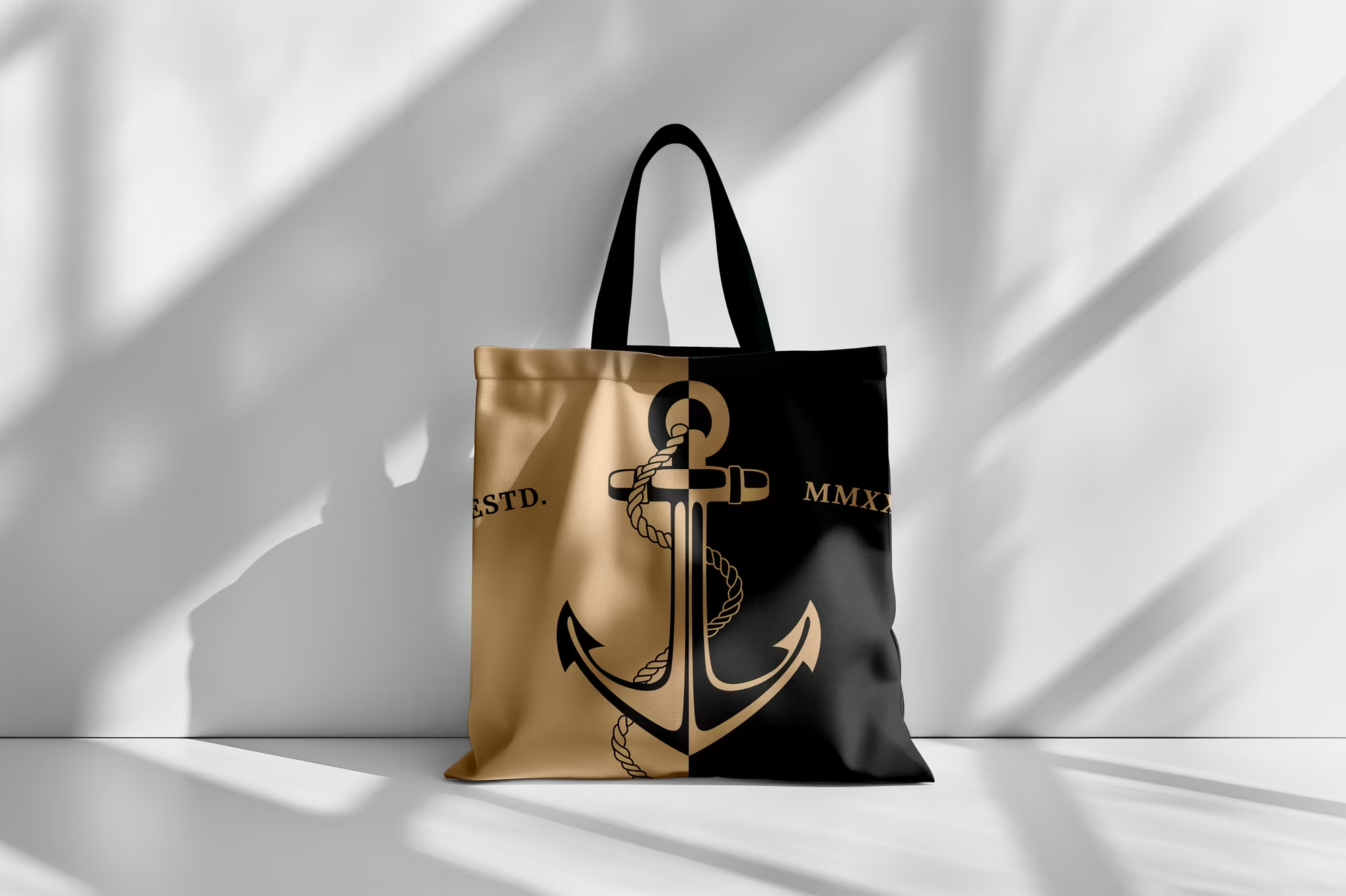
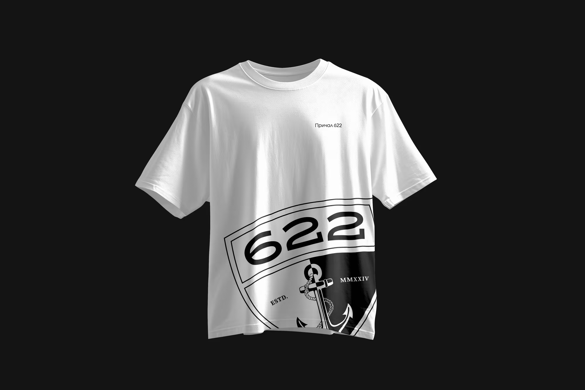
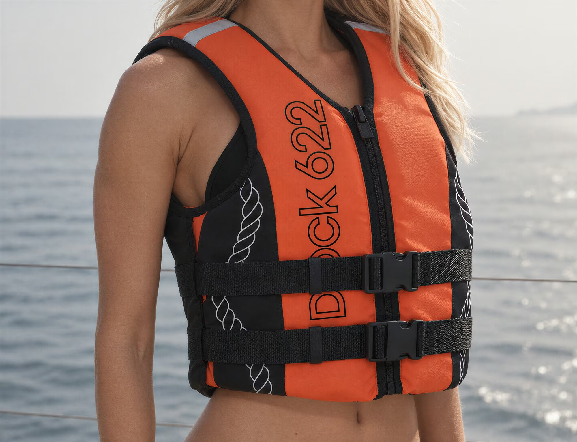
As I developed the brand applications, the emblem became a source
of distinctive graphics. The anchor, rope, and numerals became
standalone elements that could be enlarged, cropped, and arranged across
the entire surface of an item. This allows the merchandise
to convey the brand’s character even to those unfamiliar
with its name
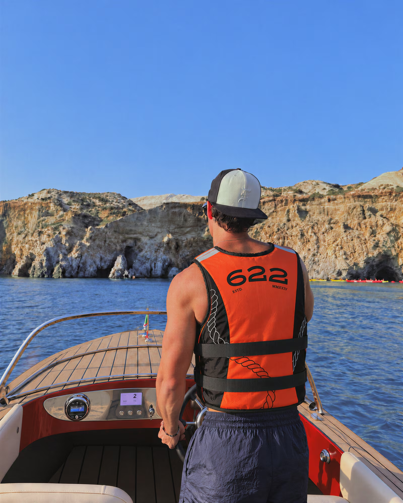
The boats’ aesthetic, which inspired the project, brought cohesion
to every detail of the leisure experience—from the emblem
on the hull to equipment for guests