Poryadok Cifr (Numbers Order) is a consulting agency that helps companies
implement financial accounting systems. The company needed a visual
identity and a landing page to communicate its positioning
and present its services
Competitor analysis revealed an opportunity to focus on content,
numbers, and key messages rather than the “design for design’s sake”
approach common in the market. The concept centres
on technology-inspired minimalism, with a clear hierarchy,
a disciplined structure, and no unnecessary decoration
A restrained two-colour logo was developed for the company, incorporating
a symbol formed from two numeral 1s in a precise geometric
arrangement. The composition conveys the order, structure,
and systematic approach the agency brings to its clients’ operations.
The symbol remains an integral part of the logo across all
applications, ensuring a consistent and recognisable visual identity
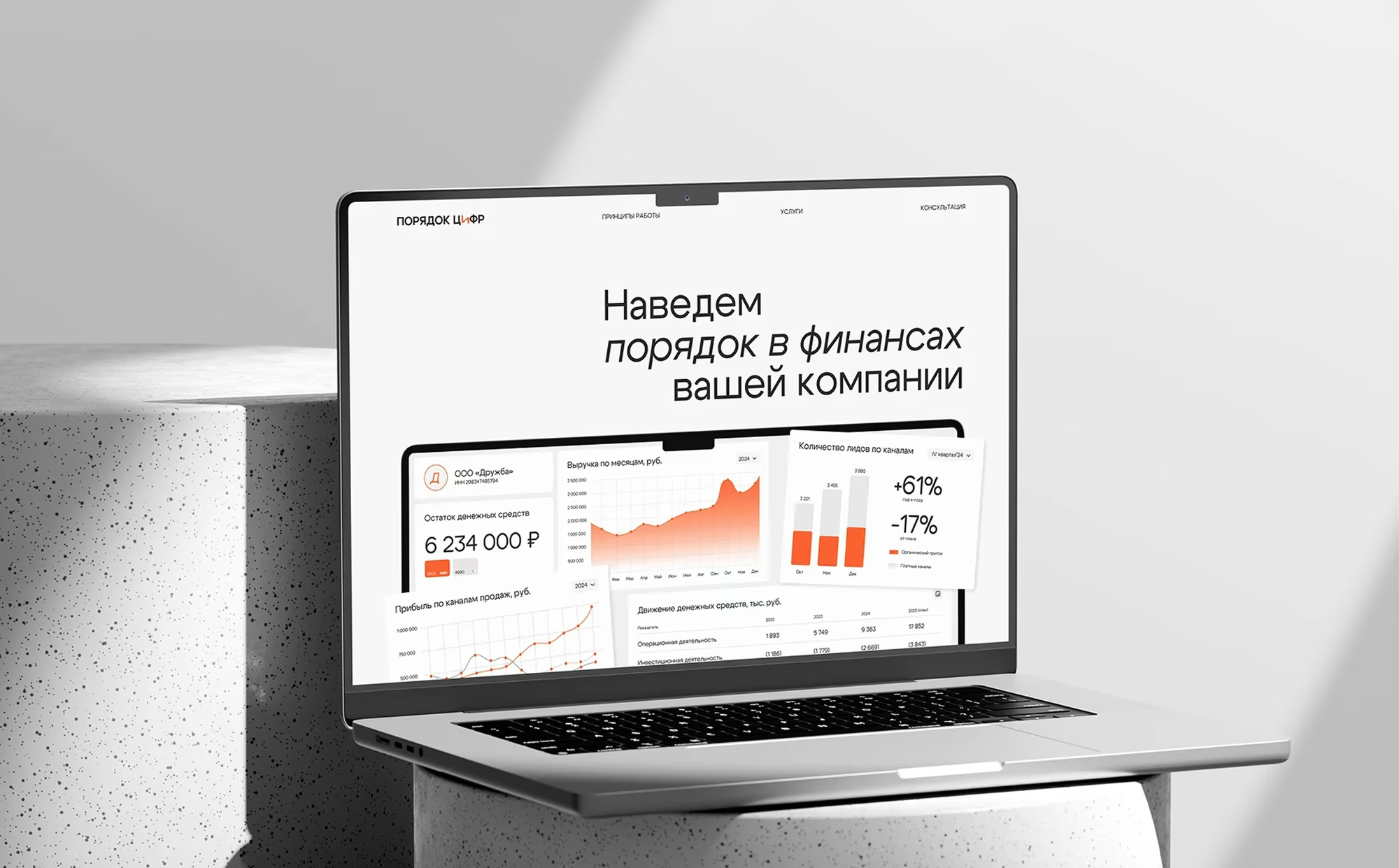
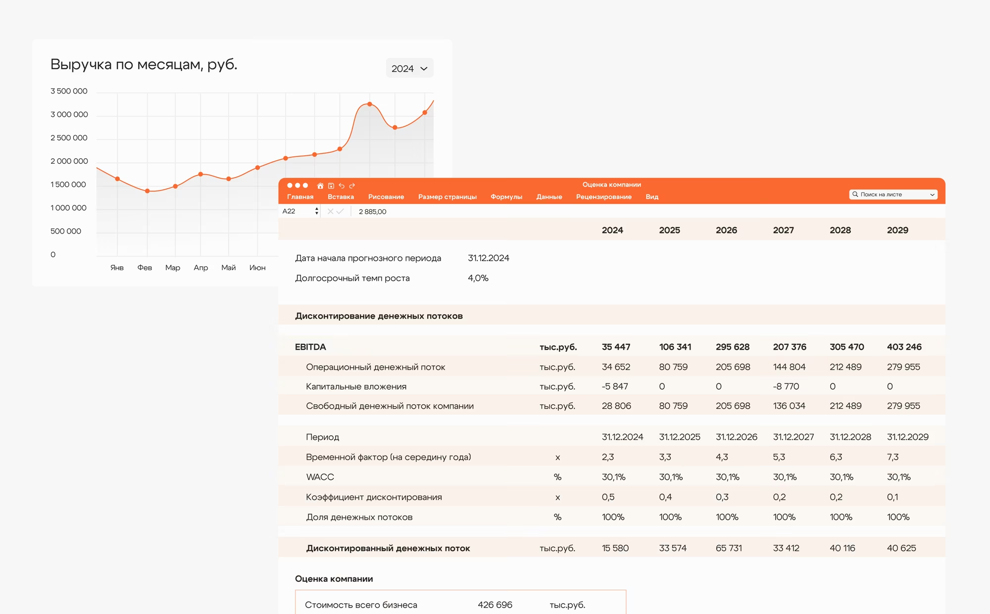
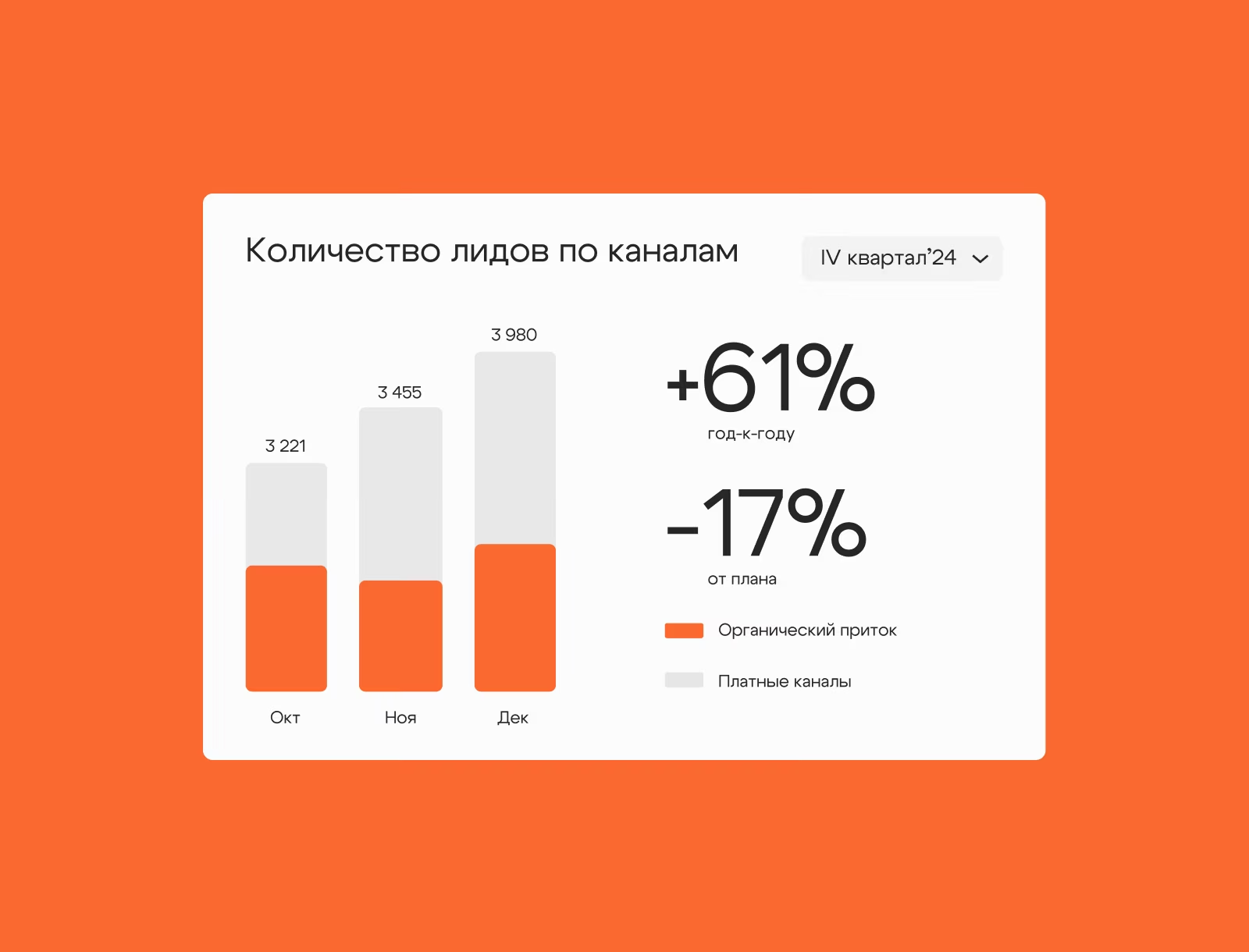
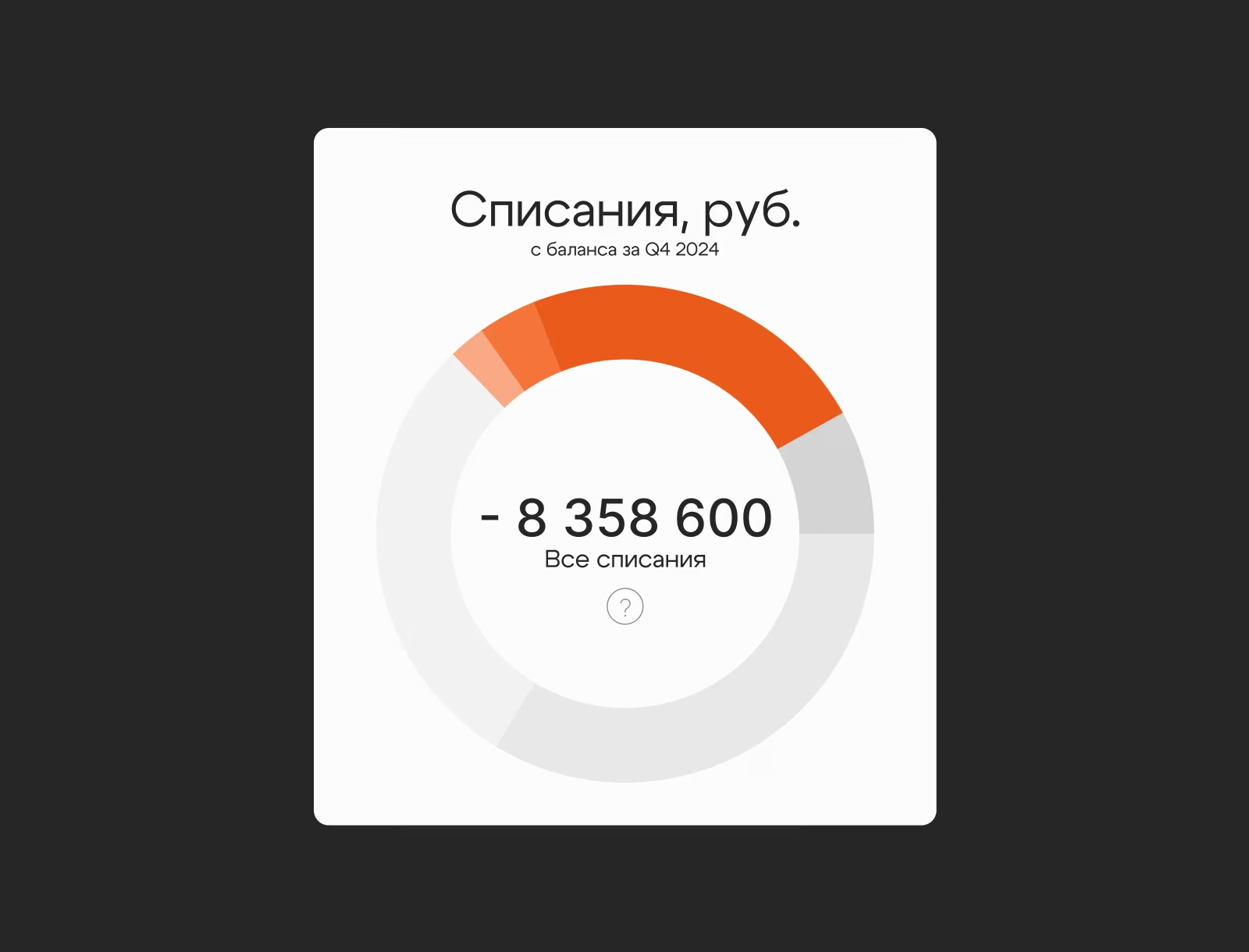
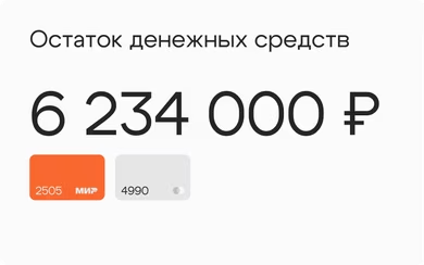
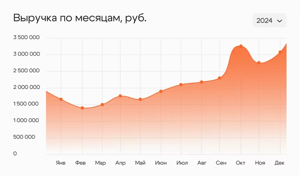
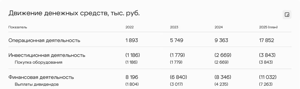
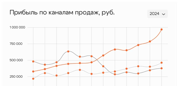
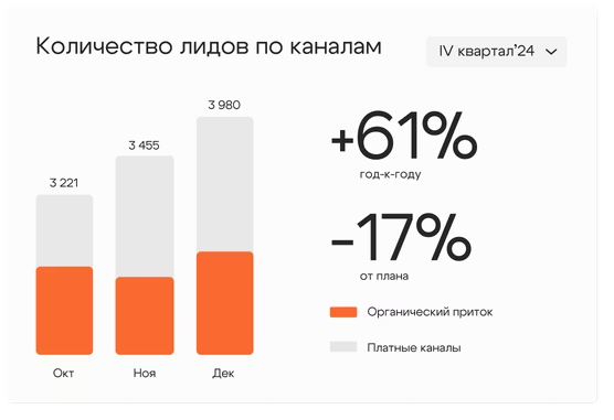
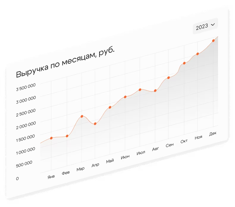
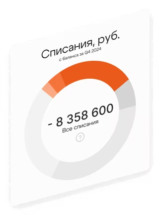
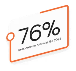
All tables, charts, and interface elements on the landing page are based
on real data from the agency’s work. The founder wanted to present
actual figures and results rather than illustrative metrics chosen
for visual effect. Every infographic and interface element was therefore
designed from scratch using the supplied data and aligned
with the site’s visual system
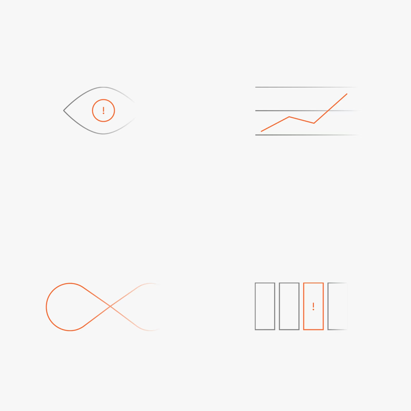
Each supporting icon was designed specifically for the project, extending
the brand’s visual language through simple, precise, and expressive forms
without unnecessary detail. This makes the graphics easy to understand
at a glance and reinforces the core principle of Poryadok Cifr:
complex tasks should be clearly structured and presented
Subtle, purposeful animations play an important role in the project.
Each reinforces the page’s message rather than serving as a decorative
effect
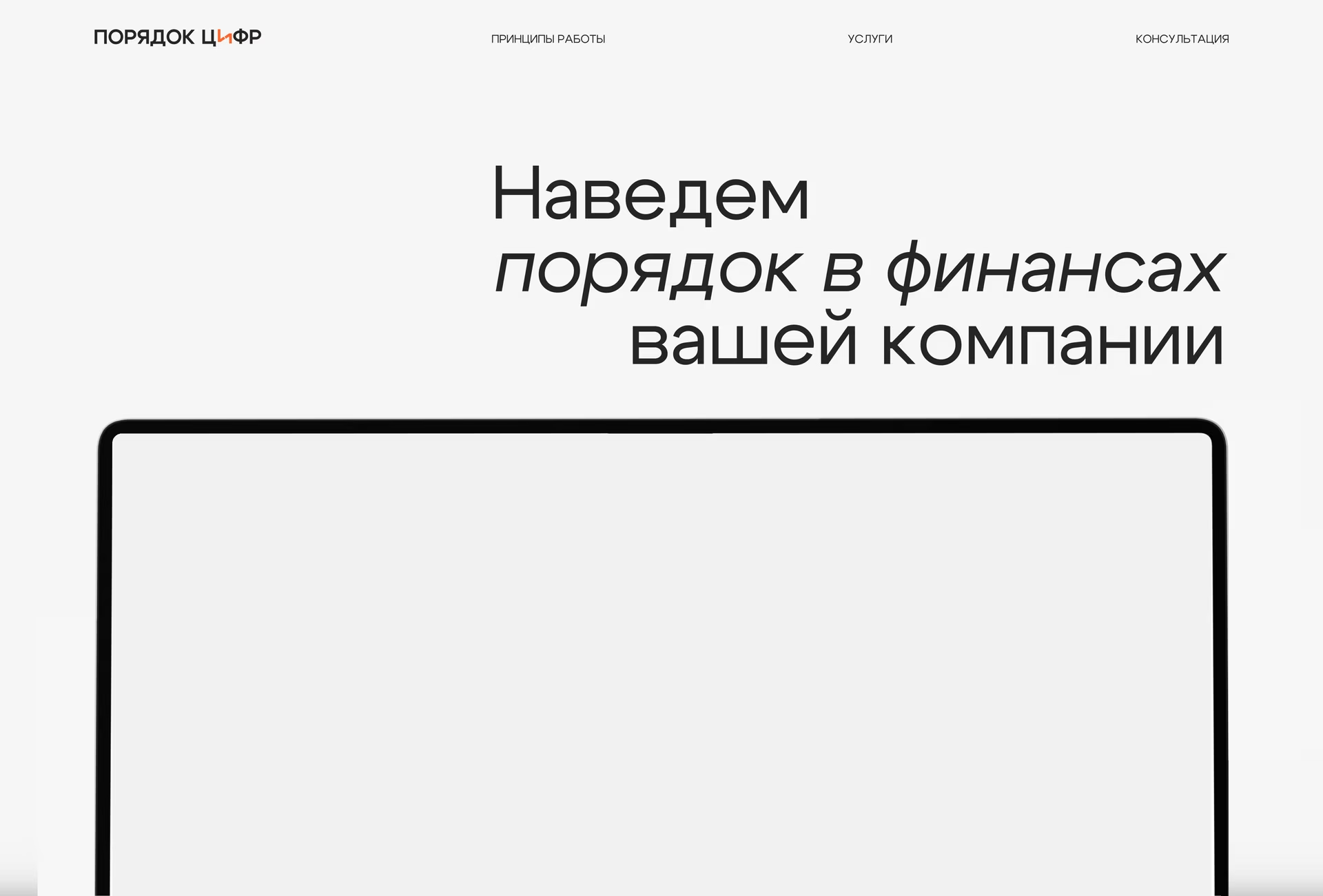
For example, the dashboard animation in the hero section illustrates
the agency’s core value proposition: elements move into place one by one,
creating a sense of order and structure
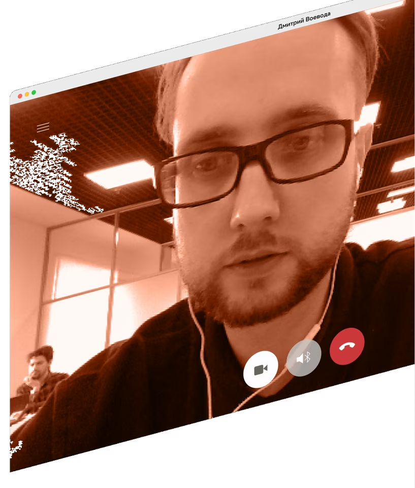
In the services section, gently moving interface windows draw the user’s
attention while remaining subtle enough to keep the text easy
to read
Particular attention was paid to the copywriting. Headlines organise
the content while conveying key ideas and adding emotional resonance
in their own right. The body copy was informed by a detailed analysis
of the competitive landscape, helping articulate the agency’s strengths,
establish a distinctive voice, and move beyond generic industry
language